The Role of Color Psychology in Web Design
In web design aesthetics and functionality play crucial roles in creating engaging and successful websites. One powerful tool that designers can harness to captivate users is color psychology. By understanding the impact of colors on human emotions and behavior, designers can strategically incorporate colors into their web designs to forge emotional connections with visitors.
Let’s explore how color psychology can be utilized to create visually appealing and emotionally resonant websites.
The Basics of Color Psychology
Color psychology is the study of how colors affect human perception, emotions, and behavior. Different colors evoke distinct psychological responses, making them an essential element in web design.
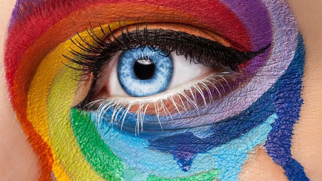
Let’s take a closer look at some commonly used colors and the emotions they tend to elicit:
Blue
Often associated with trust, serenity, and stability, blue is a popular choice for corporate websites and brands aiming to convey reliability and professionalism.
Red
Known for its energetic and passionate nature, red can evoke emotions such as excitement, urgency, and boldness. It is frequently used to grab attention and stimulate action.
Green
Symbolizing growth, harmony, and nature, green is frequently utilized in websites related to health, the environment, and wealth. It promotes a sense of calmness and relaxation.
Yellow
Bright and optimistic, yellow is associated with happiness, creativity, and warmth. It can be used to attract attention and convey a cheerful atmosphere.
Purple
Often associated with luxury, creativity, and spirituality, purple can add a touch of elegance and sophistication to a website.
Orange
Combining the energy of red and the cheerfulness of yellow, orange is known to stimulate enthusiasm, excitement, and creativity.

Harnessing Color Psychology in Web Design
Now that we know what feelings different colors can elicit, let’s look at how color psychology can be used effectively in web design to build emotional connections:
Understanding the Target Audience
Consider the demographic characteristics of your target audience. Different colors may have varying effects on different groups of people. For instance, vibrant and bold colors might appeal to a younger audience, while muted tones may resonate with a more mature demographic.
Brand Consistency
Colors play a significant role in brand recognition and identity. Incorporate your brand’s primary colors into your web design to maintain consistency and reinforce brand messaging. This creates a cohesive experience for users and enhances brand recall.
Emphasizing Call-to-Action (CTA) Buttons
Use contrasting colors for your CTA buttons to make them stand out and encourage user interaction. Consider the emotions you want to evoke when selecting colors for your buttons. For example, red or orange buttons can be effective if you want to create a sense of urgency.
Creating Visual Hierarchy
Colors can help guide users’ attention and highlight essential elements. Use contrasting colors to differentiate between headings, subheadings, and body text. This not only enhances readability but also enhances the overall user experience.
Cultural Considerations
Be mindful of cultural associations with colors. Colors can have different meanings and connotations across various cultures. Ensure your color choices align with your target audience’s cultural sensitivities to avoid any unintended misunderstandings.
Best Practices for Color Implementation
It is important to keep the following best practices in mind to optimize the use of color psychology in web design:
Limited Color Palette
Avoid overwhelming visitors with too many colors. Use a harmonious color scheme consisting of a few carefully selected colors that complement each other.
Contrast and Accessibility
Ensure sufficient contrast between text and background colors to guarantee readability, especially for users with visual impairments. Adhering to accessibility guidelines enhances user experience and inclusivity.
Use Color Theory
Familiarize yourself with color theory principles such as complementary, analogous, and triadic color schemes. These principles can guide your color choices and help you create visually appealing and balanced designs.
Test and Iterate
Conduct A/B testing to gauge user responses to different color variations. Monitor user behavior, engagement, and conversion rates to make informed decisions and continually improve your web design.
Conclusion
Incorporating color psychology into web design allows designers to tap into the powerful realm of emotions and create meaningful connections with users. By understanding the psychological impact of different colors, designers can strategically select and apply colors to evoke specific emotions and enhance user experiences. Remember to consider your target audience, maintain brand consistency, and follow best practices to optimize the use of color psychology in web design. With careful consideration and experimentation, you can create visually captivating and emotionally engaging websites that leave a lasting impression on visitors.


