Why a Bigger Logo Can Harm Your Brand (And What to Do Instead)
“Can you make the logo bigger?”
It is one of the most common requests in website design and branding. As a business owner, your logo represents your pride, your identity, and the hard work you’ve poured into building your company. Naturally, you want visitors to see it immediately when they land on your site.

However, in modern digital marketing, pushing for a massive logo often backfires. On today’s screens, especially mobile viewports, an oversized logo distracts visitors, disrupts visual hierarchy, and actively harms your conversion rate.
Here is why making your logo bigger hurts your website performance, and what smart brands do instead to build instant credibility.
1. It Kills Mobile Viewport Real Estate
More than 60% of all web traffic comes from mobile devices. When someone opens your site on a smartphone, you have a tiny vertical window, known as the above-the-fold viewport, to capture their attention and explain what you do.
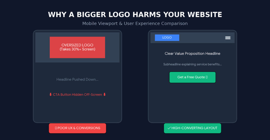
If your logo takes up 150 to 200 pixels of vertical height at the top of the screen:
- Your main value proposition (H1 headline) gets pushed down.
- Your primary Call-to-Action (CTA) button disappears off the screen.
- Visitors have to scroll just to figure out what services you offer.
Your logo identifies who you are, but your headline tells visitors what you can do for them. Never sacrifice messaging space for brand iconography.
2. Sticky Headers Elicit “Navigational Claustrophobia”
Most modern websites use sticky headers, navigation bars that stay fixed to the top of the browser as users scroll down the page.
If your header contains a massive logo, that fixed bar can swallow up 20% to 30% of the entire screen height while users are trying to read your content. This creates a cramped, claustrophobic browsing experience that annoys users and causes higher bounce rates.
3. It Disrupts Visual Hierarchy and Trust
In professional custom website design, visual hierarchy guides the visitor’s eye to the most important elements in order:
- The Offer / Value Proposition: What problem do you solve?
- The Call to Action: What should the visitor do next? (e.g., “Get a Free Quote”, “Book an Appointment”)
- Proof & Trust Signals: Customer reviews, certifications, and brand identity.
When a logo is disproportionately large, it demands top visual priority. But visitors do not buy from you simply because your logo is giant, they buy because your message resonates and your site is easy to navigate. A giant logo signals amateur design, whereas balanced, intentional sizing projects understated confidence.
4. What to Do Instead: The Responsive Logo Strategy
Instead of forcing a single large logo onto every screen size, modern businesses use responsive branding techniques.
A. Implement a Micro-Brand / Monogram Variant
Top global brands alter their logos based on screen real estate. Create a simplified “micro-logo” or icon mark (like a monogram or brand symbol) specifically for mobile headers, sticky menus, and favicons.
B. Use SVG Vector Format
Never upload giant raster PNG or JPEG files for your logo. Use clean, scalable vector graphics (.SVG) so your logo remains crisp and razor-sharp on Retina displays at a compact size, while keeping your page lightweight for website speed optimization.
C. Embrace Whitespace Around the Logo
If your logo feels too small, the solution is rarely increasing its dimensions. Instead, add clean padding (whitespace) around it. Giving your logo room to breathe makes it stand out more effectively than making the graphic larger.
Elevate Your Brand Identity the Right Way
A great logo should anchor your website, not dominate it. By pairing a balanced, responsive logo with clear copy and strong call-to-action buttons, you create a seamless user experience that turns casual visitors into paying clients.
If your current site feels dated or out of balance, explore our professional brand identity and graphic design services or contact Graphicten today to discuss a modern website refresh for your business.