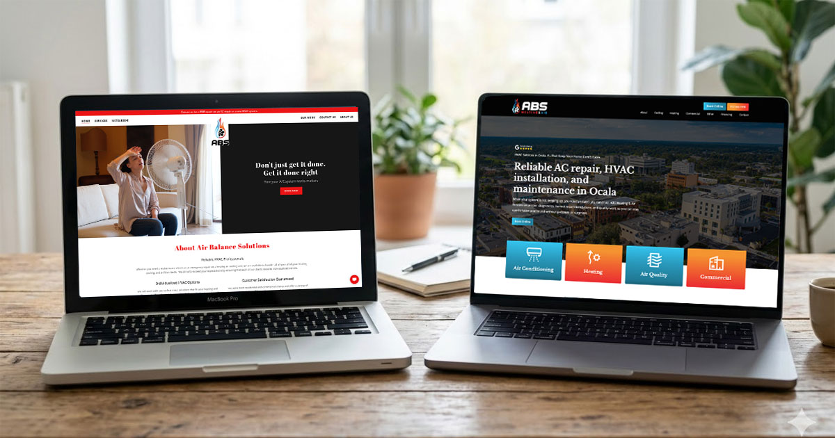
Why You Should Embrace Whitespace in Web Design
When you think about great web design, what comes to mind?
Bold colors? Stunning images? Fancy typography?
While these are all important, there’s one design element that often goes unnoticed but plays a major role in making a website look clean and professional—whitespace.
Whitespace isn’t just empty space. It’s a powerful design tool that improves readability, user experience, and visual appeal. In this article, we’ll explore why whitespace matters and how it can transform your website.
What is Whitespace in Web Design?
Whitespace, also known as negative space, is the empty space around text, images, and other design elements. It doesn’t have to be white—it can be any background color, texture, or even an image.
There are two types of whitespace:
- Micro whitespace – Small spaces between text lines, paragraphs, buttons, and UI elements.
- Macro whitespace – Larger spaces between sections, images, or layout blocks.
Well-used whitespace creates a balanced layout that makes a website easier to navigate and read.
1. Enhancing Readability and Comprehension
Ever tried reading a website with small, crammed text and no spacing? It’s exhausting! When text is too close together, it’s hard to focus and process information.
Whitespace improves readability by:
- Making paragraphs easier to scan
- Giving eyes a break between sections
- Organizing information in a structured way
According to Harvard’s Digital Accessibility guidelines, using whitespace effectively helps group related content, improving readability and comprehension. Proper spacing allows users to process information more easily rather than struggle with dense or cluttered layouts.
Best Practices for Readability:
- Use line spacing (1.5x the text size) for easier reading
- Keep paragraphs short (2-4 sentences)
- Add padding around text to create breathing room
2. Creating a Better User Experience (UX)
Whitespace isn’t just about making a website look nice—it helps guide users through your site. When elements have enough space, visitors naturally follow the flow of content.
Imagine visiting a cluttered website with text and buttons squeezed together.
It feels overwhelming, right?
Now picture a website with clear spacing, large headings, and well-separated sections. It’s easier to navigate, find information, and take action.
How Whitespace Improves UX:
- Scannability – Users can skim content and quickly find what they need
- Focus – Important buttons and CTAs (Call to Actions) stand out
- Less stress – A clean design reduces cognitive load, making the experience more enjoyable
3. Establishing Visual Hierarchy and Focus
Whitespace helps create visual hierarchy, which means guiding users’ eyes to the most important parts of a page.
For example, a Call-to-Action button (like “Sign Up” or “Get a Quote”) should have space around it to make it stand out. If it’s buried in a block of text, people might miss it.
Ways to Use Whitespace for Focus:
- Increase spacing around buttons to draw attention
- Add margins around key content sections
- Use white space to separate important headlines
Many luxury brands use whitespace to highlight exclusivity. Their websites feel minimalist, elegant, and high-end—all thanks to well-placed whitespace.
4. Whitespace and Aesthetic Appeal
A cluttered website feels messy, while a site with balanced whitespace looks clean and modern.
Many top brands, like Apple and Google, use whitespace heavily. Apple’s product pages, for example, have plenty of space around images and text, making the design feel premium.
Psychological Effects of Whitespace:
- Professionalism – Makes a website feel more polished
- Trustworthiness – Clean designs feel more reliable and credible
- Luxury Appeal – More whitespace = more elegance
A good rule of thumb: If your site looks too crowded, try removing elements rather than squeezing in more. Less is often more in web design!
5. Performance and Accessibility Benefits
Whitespace isn’t just for aesthetics—it also impacts site performance and accessibility.
- Faster Load Times – Fewer elements on a page mean quicker loading speeds, which improves SEO rankings.
- Better Mobile Experience – Mobile screens are small, so proper spacing makes navigation easier.
- Accessibility – People with visual impairments benefit from well-spaced text and elements that are easy to tap on.
By incorporating whitespace, you’re not just improving design—you’re creating a website that works for everyone.
6. Common Mistakes When Using Whitespace
While whitespace is essential, too much or too little can hurt your design.
- Overusing whitespace – Too much empty space can make a site feel incomplete or lack information.
- Underusing whitespace – Cluttered layouts make it hard to navigate and read.
- Inconsistent spacing – Uneven margins or padding can make a site look unbalanced.
💡 Pro Tip: Always aim for harmony—enough space to guide users, but not so much that the site feels empty.
7. Practical Tips for Using Whitespace Effectively
Now that you know why whitespace is important, here are some actionable tips to implement it on your website:
- Use generous line spacing for text (1.5x for body text, 1.2x for headings)
- Add spacing between sections to improve clarity
- Use padding around buttons and links to improve clickability
- Avoid cramming too much content into one section—break it up into smaller chunks
- Test different layouts and see what works best for readability and engagement
Conclusion
Whitespace is one of the most powerful yet underrated elements in web design. It improves readability, enhances user experience, and makes a website look more professional.
If your website feels cluttered or hard to navigate, try adding more intentional whitespace. A well-balanced design isn’t about filling every space—it’s about making every element count.
Are you using whitespace effectively on your website? If not, let’s talk!


